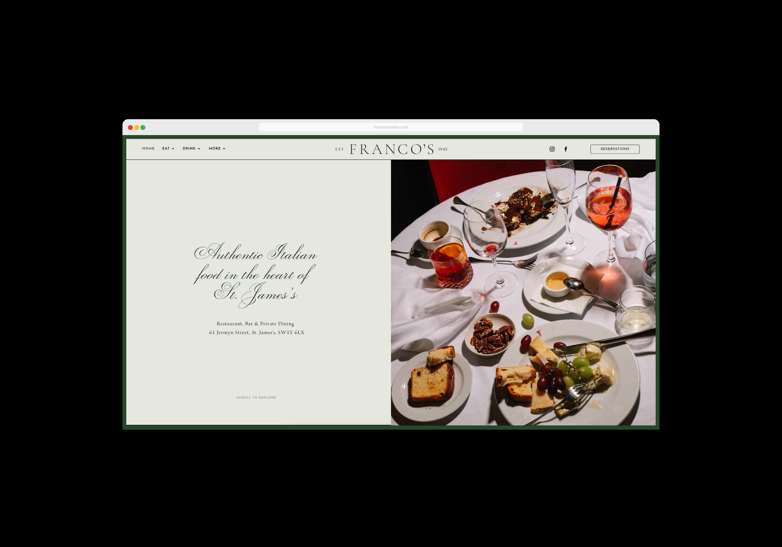
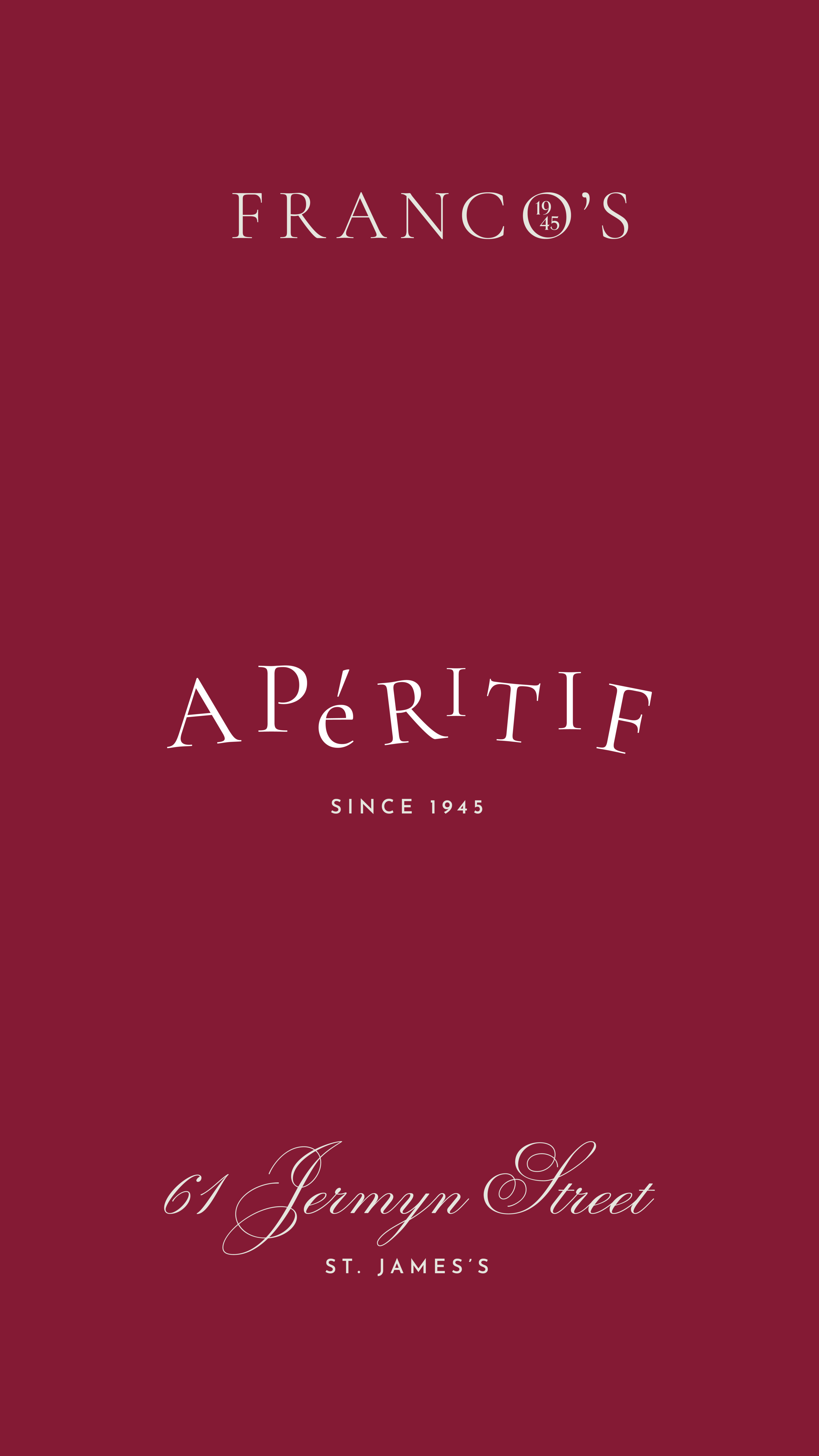
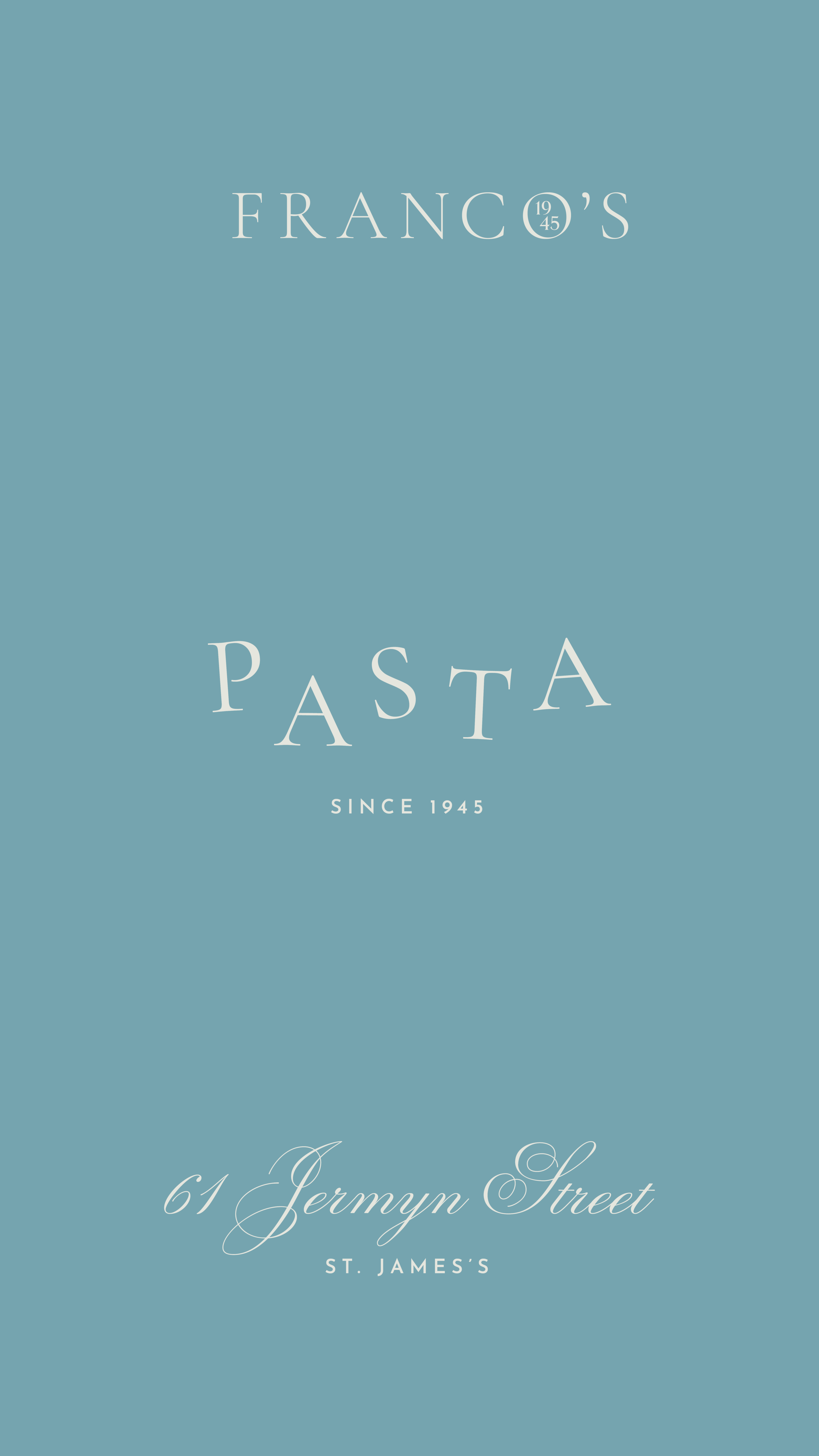
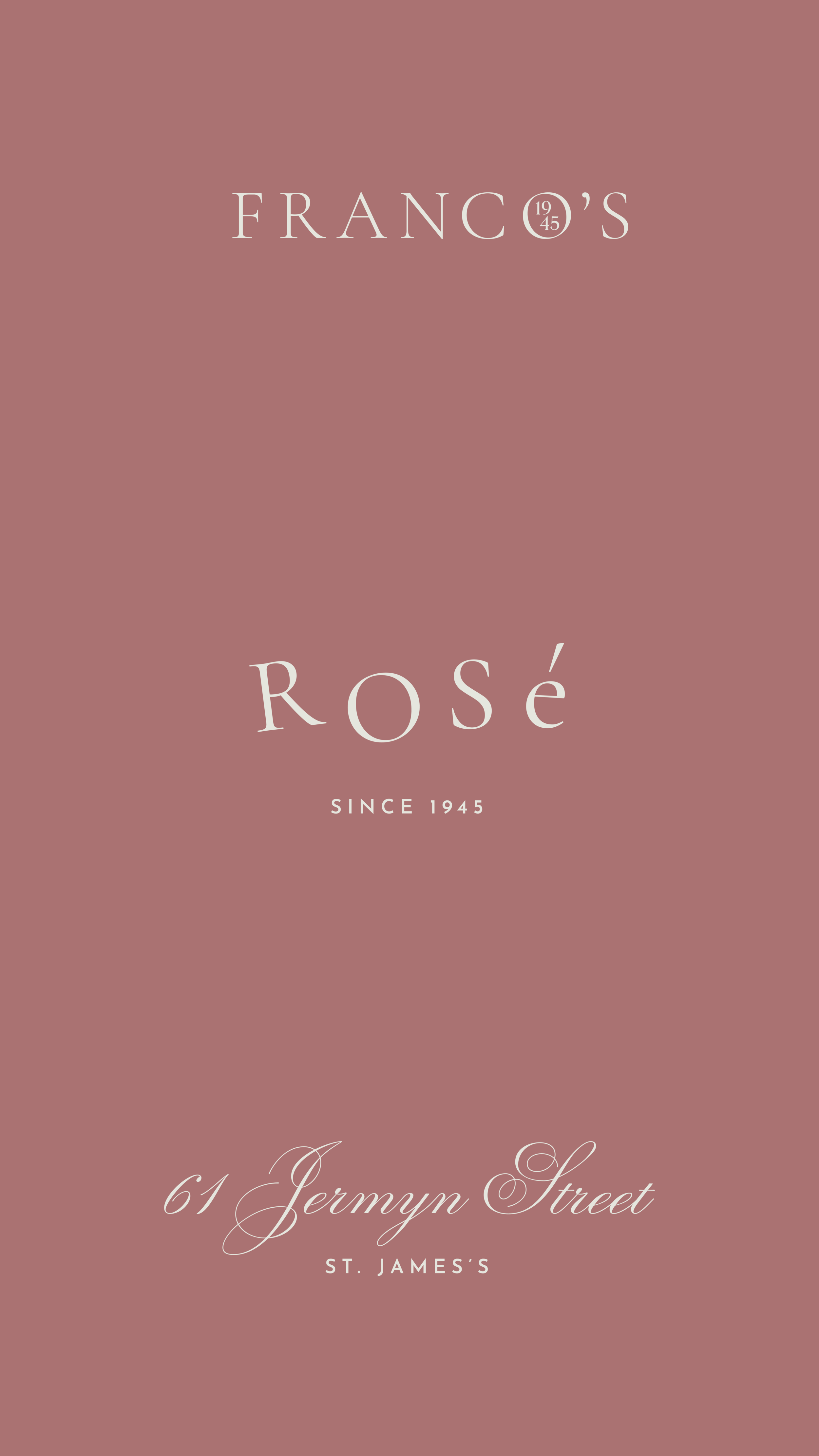
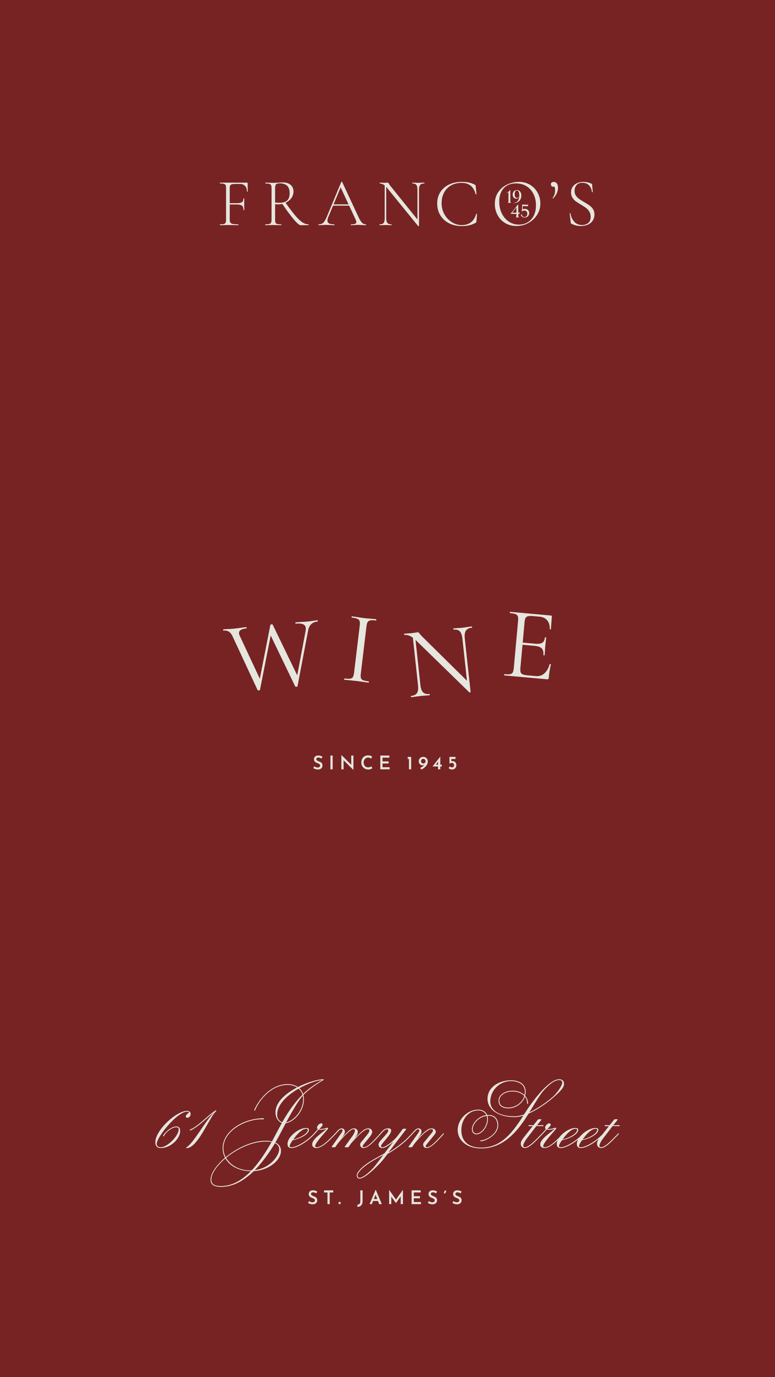
Tastefully paired with photography by James Thompson of FoodFeels, the new Franco’s identity captures the authentic nature of the restaurants heritage. It injects an element of fun, whist retaining its charm and sophistication.
The updated word-mark (below) takes inspiration from the restaurants original facade and signage, combining this with traditional Italian design touches. The Franco’s word mark can be used in several ways, with the main variation encompassing the date of opening, 1945, housed inside the classic European tilted O.
We paired the new word-mark with a beautiful cursive typeface, and a juxtaposing modern sans-serif accent typeface, for when a more detailed version of the word-mark is needed.


