FRANCOSLONDON.COM
BRAND IDENTITY
FRANCO’S LONDON
Franco’s London
Full Service
Established in 1945 as one of London’s original Italian restaurants, Franco’s has built a cult following through decades of classic Italian cooking and enduring charm. As the brand’s digital presence no longer reflected this legacy, we led a considered refresh to realign Franco’s online experience with the old-school Italian spirit that defines it.
Drawing from archival materials, we developed an updated identity that honoured the original Franco’s façade while translating it for a contemporary, digital-first context. The creative approach was carefully calibrated to protect the loyalty of long-standing regulars, while using modern platforms and refined imagery to engage a younger audience—ensuring the brand’s relevance, visibility, and continued growth without compromising its heritage.
SERVICES
BRANDING
PHOTOGRAPHY
WEB DESIGN
CREATIVE CONSULTING
COLLATERAL
CREDITS
JAMES THOMPSON
FOODFEELS
WE ARE PEACHE

INTRODUCTION
Photography played a pivotal strategic role in repositioning Franco’s for a new generation of diners. By commissioning James Thompson of foodfeels, we enabled the brand to connect with an audience that values atmosphere as highly as cuisine—seeking places that feel both comforting and elevated, rich in character and history. This approach helped Franco’s remain culturally relevant while preserving its emotional appeal.
Using high-flash lighting, the imagery achieves an authentic, timeless quality—flattering the food while feeling spontaneous and lived-in. The result injects a sense of playfulness without losing the charm and sophistication expected of the restaurant, supporting stronger engagement across digital platforms.
The updated wordmark draws directly from Franco’s original façade and signage, reinterpreted through classic Italian design cues for contemporary use. Designed for flexibility, the core mark incorporates the opening date, 1945, set within a traditional European tilted “O,” reinforcing heritage while improving recognisability across touchpoints.
This is complemented by a refined typographic system: a graceful cursive paired with a modern sans-serif accent, allowing the identity to adapt across formats and levels of detail. Combined with James’s narrative-led photography, the overall system delivers a modern homage to new-world Italiana—one that strengthens brand distinction, broadens appeal, and supports long-term growth.
“London’s original Italian.”

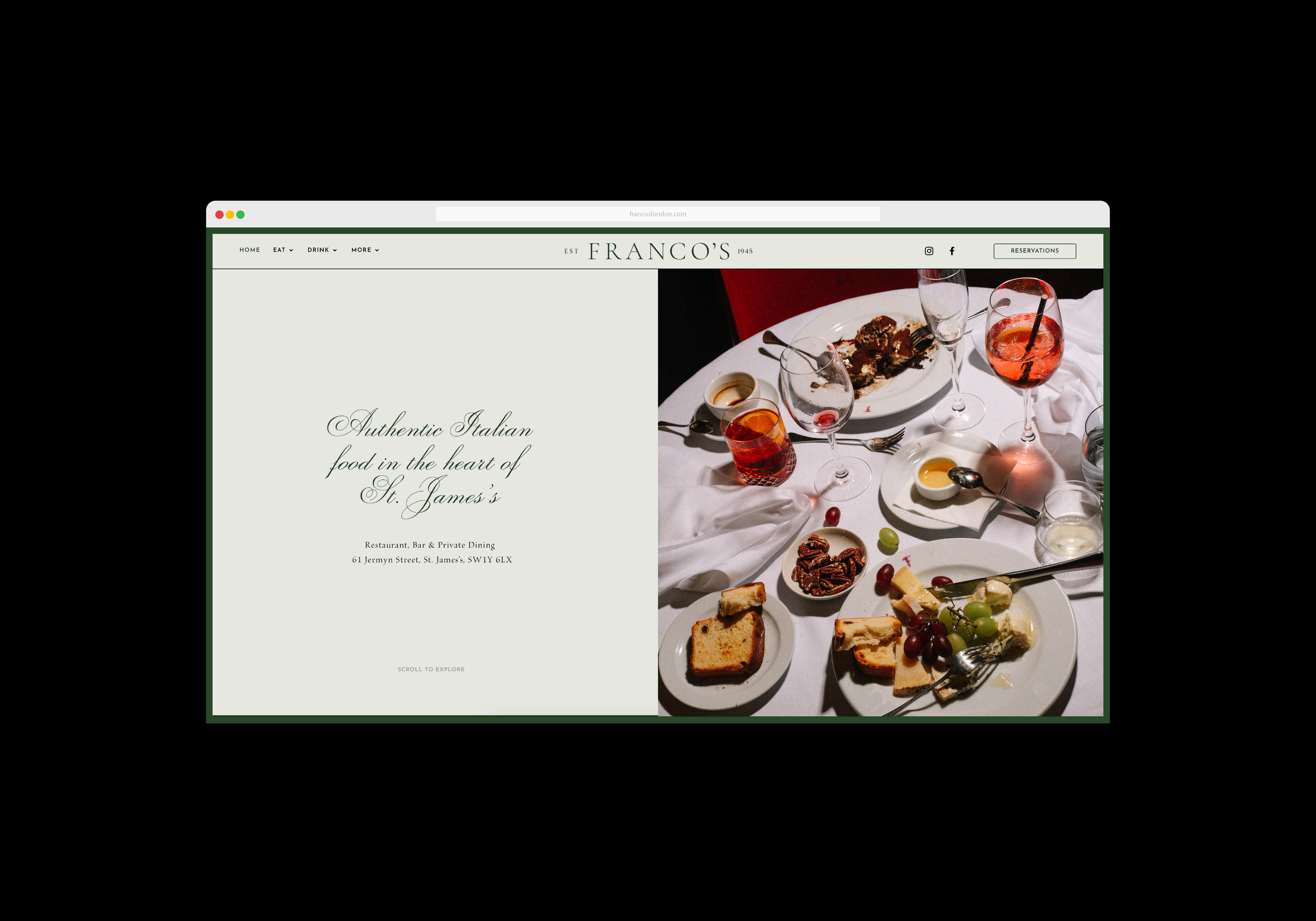
The website carefully balances the refreshed brand identity and photography with an intuitive, user-focused layout. Generous use of negative space and refined design details create a sense of calm confidence, ensuring the experience feels elevated while remaining easy to navigate.
Full-bleed imagery, framed by a subtle green border, adds a distinctive yet understated brand signature. Paired with restrained animations and smooth transitions, the design encourages users to explore more deeply—guiding them through Franco’s story, heritage, and atmosphere, while increasing engagement and time spent on the site.