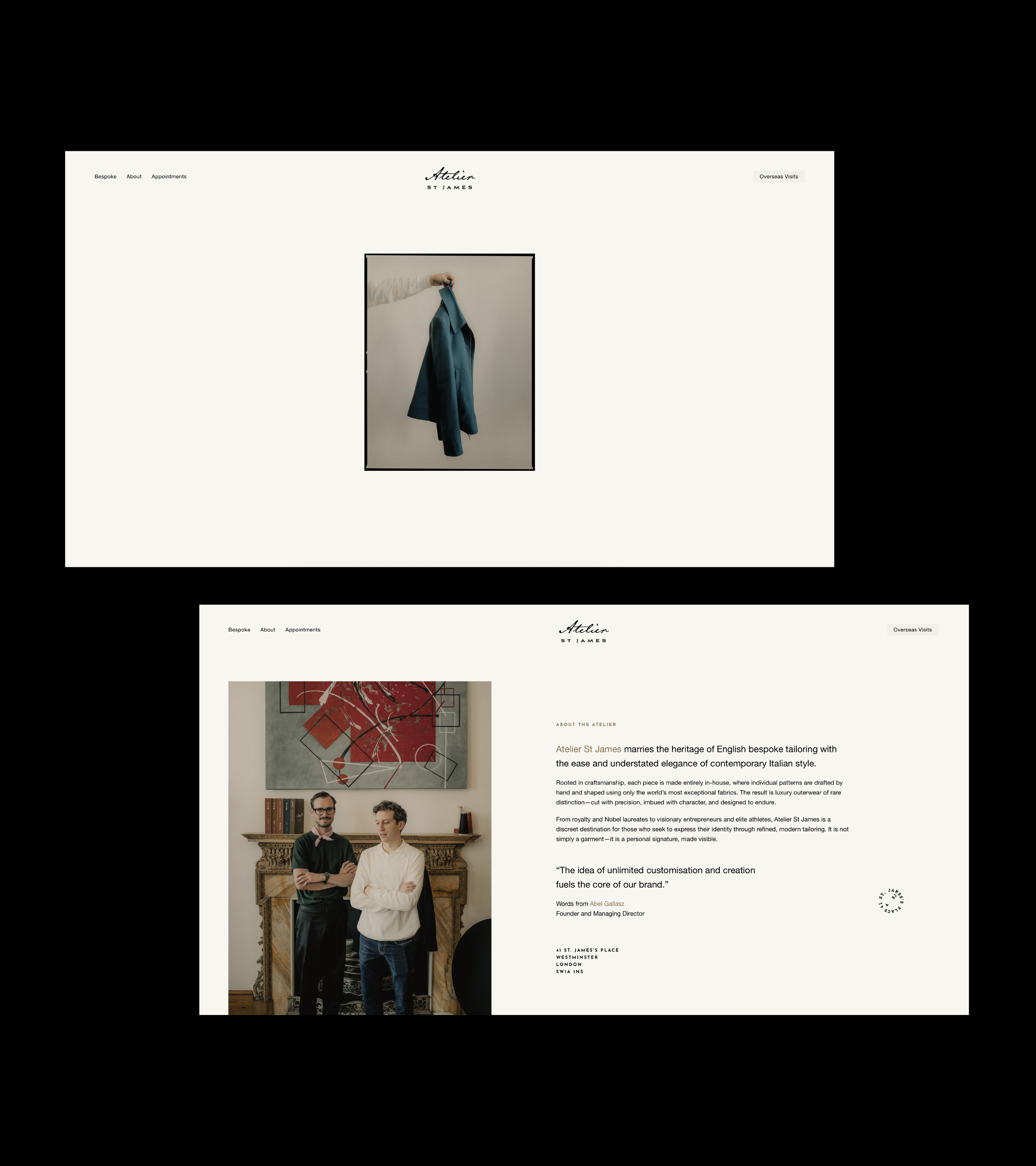
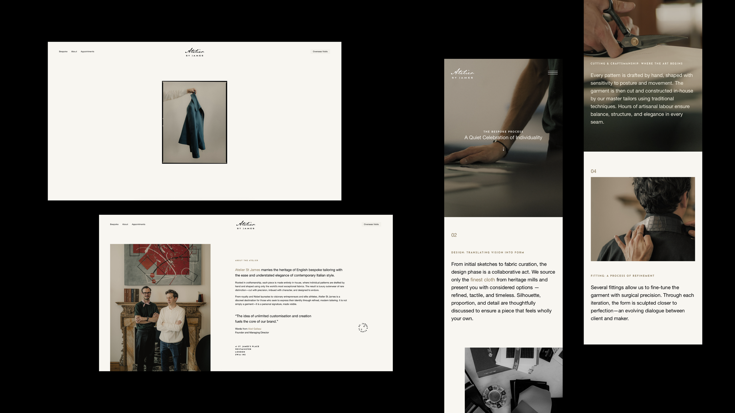
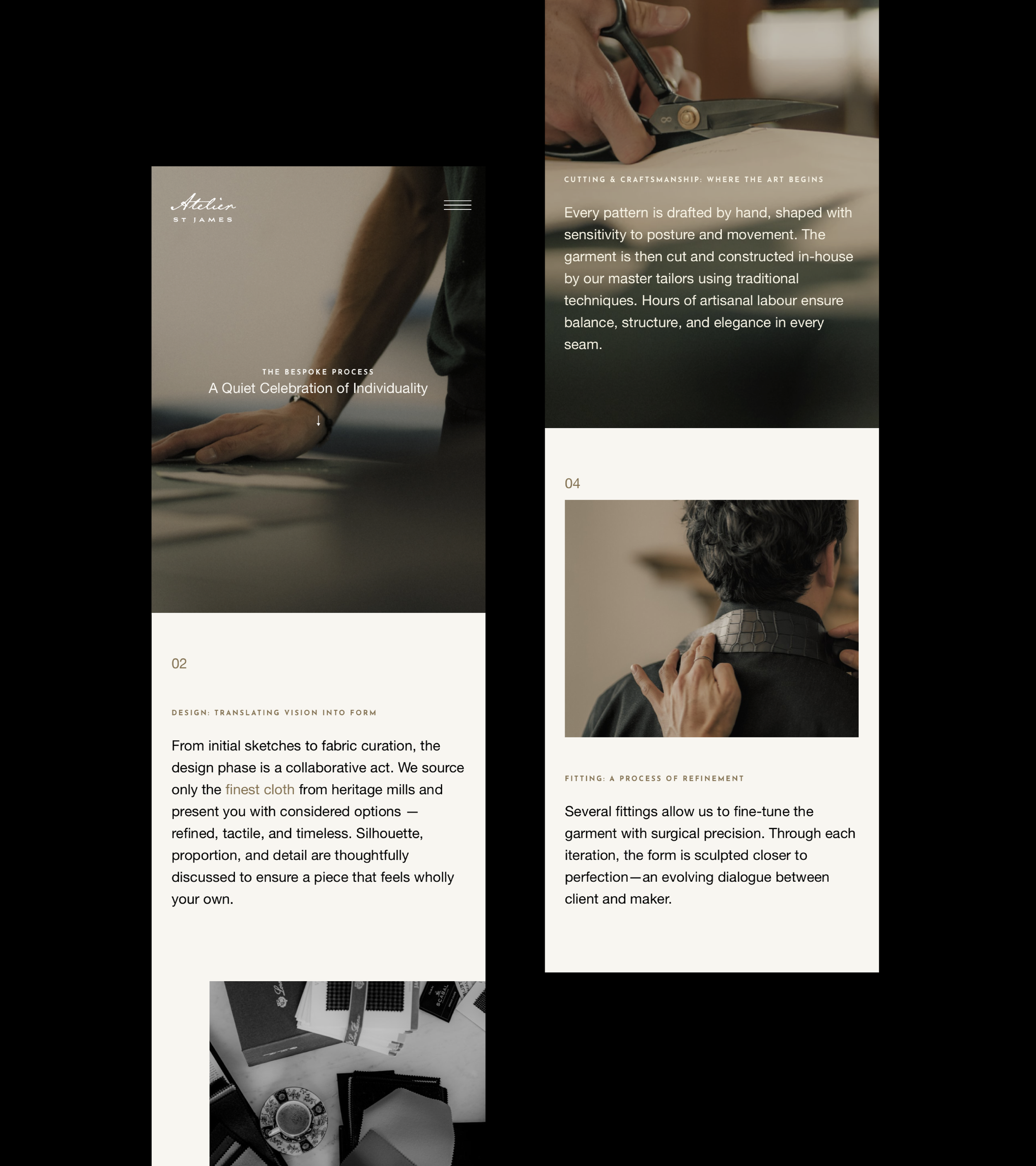
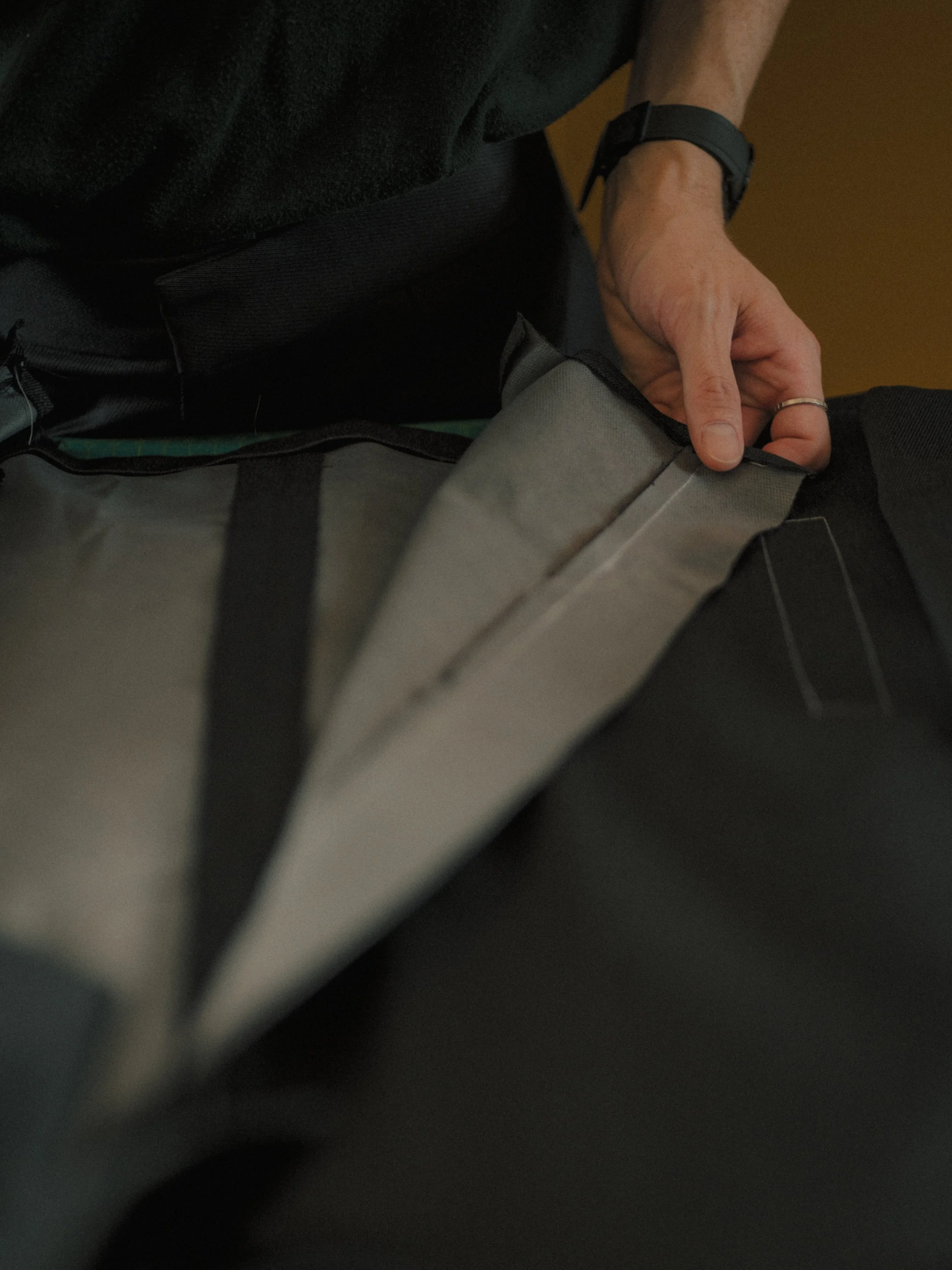
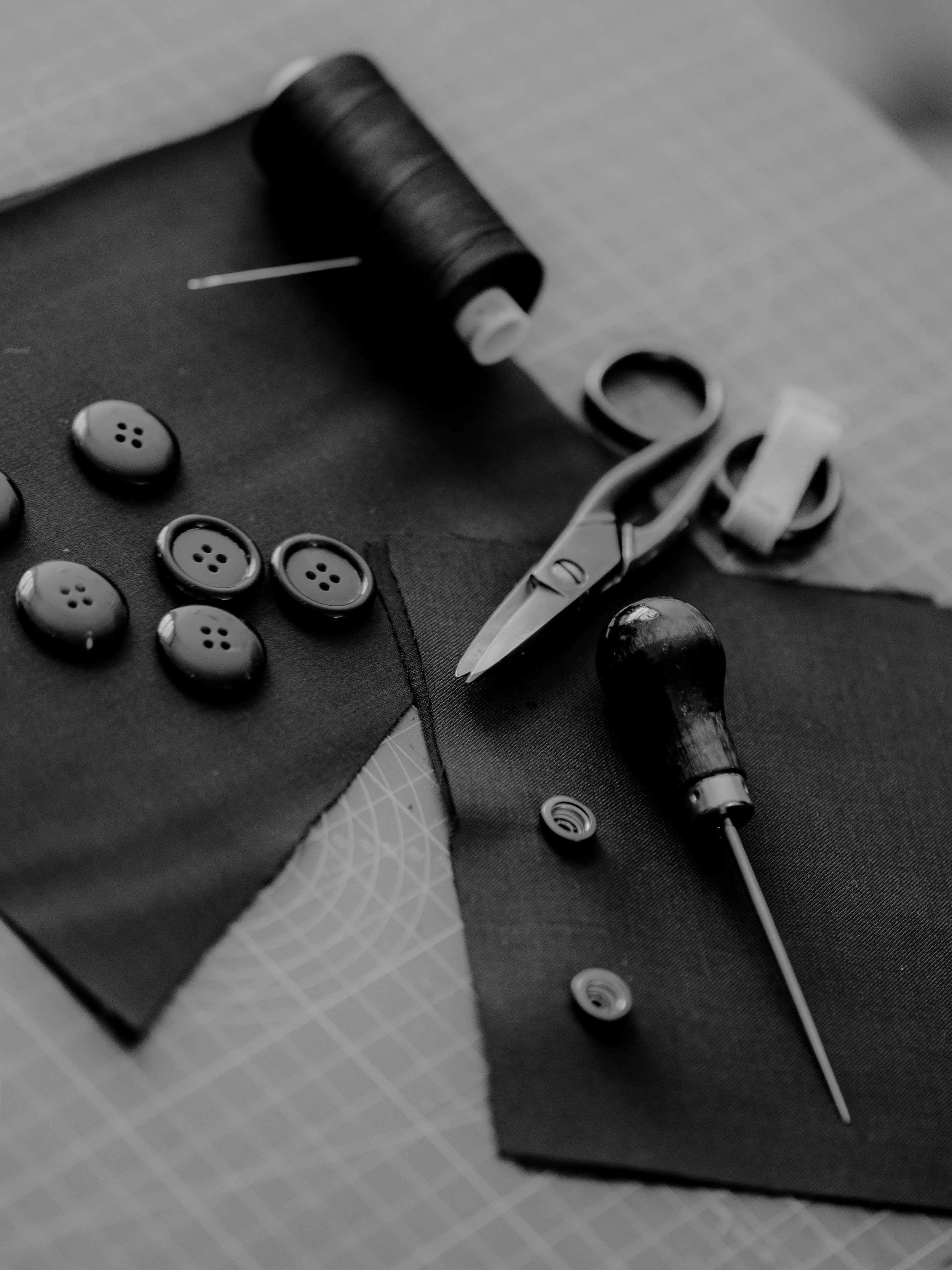
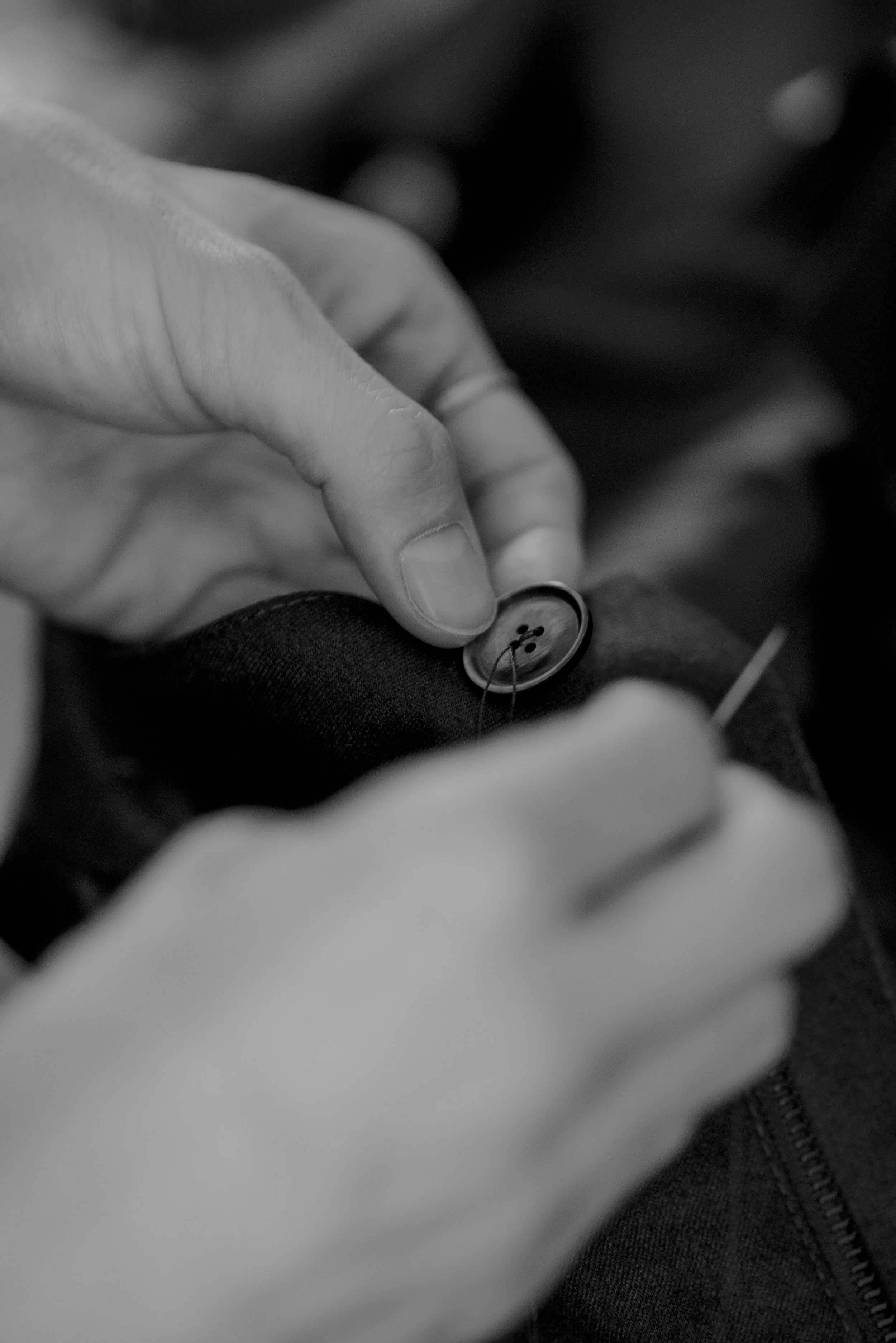
As a relatively blank canvas, the project focused on building strong commercial foundations for the next phase of the brand’s growth. Adesso Partners created a new identity and digital presence that clarify Atelier St James’ positioning—ensuring it feels confident, credible, and distinct in a competitive luxury landscape. Minimal and restrained in style, the system allows the atelier to focus attention on what matters most: the craft of bespoke tailoring, expressed through a contemporary sensibility and subtle Italian flair.
Every element was considered with intent, from the refined visual language to the narrative-driven storytelling that communicates process, expertise, and value. This balance of heritage and modernity enables the brand to honour its past while projecting confidence in its future—supporting recognition, trust, and long-term relevance. The result is a discreet, ‘if you know, you know’ presence, paired with a physical shopfront that mirrors the atelier’s meticulous approach and personal service.
“A refined ‘if you know, you know’
kind of presence.”
Atelier St James remains a destination for royalty, Nobel laureates, visionary entrepreneurs, and elite athletes alike—offering not simply garments, but a deeply personal expression of identity, crafted with precision and purpose. Scroll to view the full project and photography.